The Colour of Vision, The Colour of Joy
- Published 2013.8.08
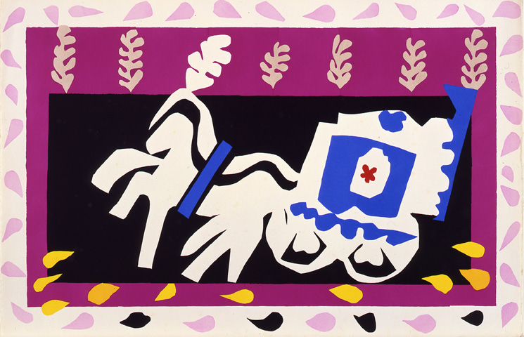
Henri Matisse, Ōģ® Pierro's Funeral from Jazz, 1947
Within 500 meters of Tokyo Station is an astonishing concentration of galleries and art museums. Not all of them merit a visit if you aren't already in the area, but the Bridgestone Museum's current exhibition is worth having a peep at.
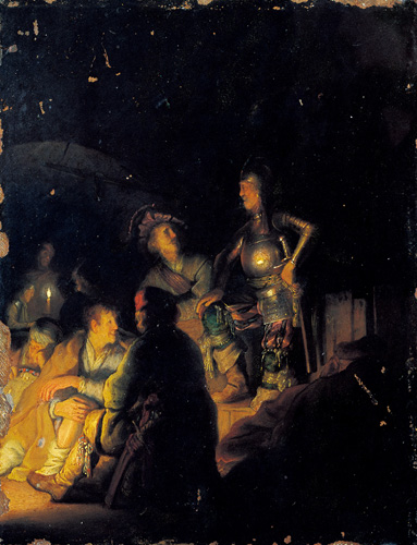
REMBRANDT van Rijn, A Biblical or Historical Nocturnal Scene, 1626-28
As is standard practice with most museums, their exhibitions are chiefly organized around pieces from their permanent collection. This time, the Bridgestone Museum has put together an exhibition on the basis of colour ŌĆō mapping how the use of colour has changed over time. Thus, we are led through a selection of paintings in more or less chronological order, beginning with Rembrandt and ending somewhere in the first half of the 20th century.
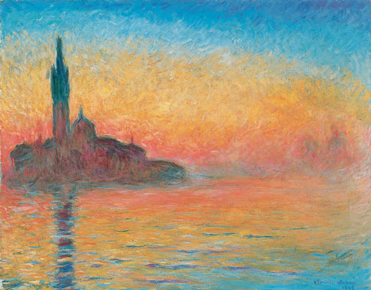
Claude MONET, Twilight, Venice, c.1908
'Colour' seemed a slightly tenuous method of organizing an exhibition, but it was quite enjoyable nonetheless. They have a decent collection of Impressionist and Post-Impressionist painting, with a few borrowed Picassos thrown in to boot. There are pieces by Renoir and Monet, all diffuse, luminous colour; then there are bright, blocky paintings by Cezanne and Gauguin.
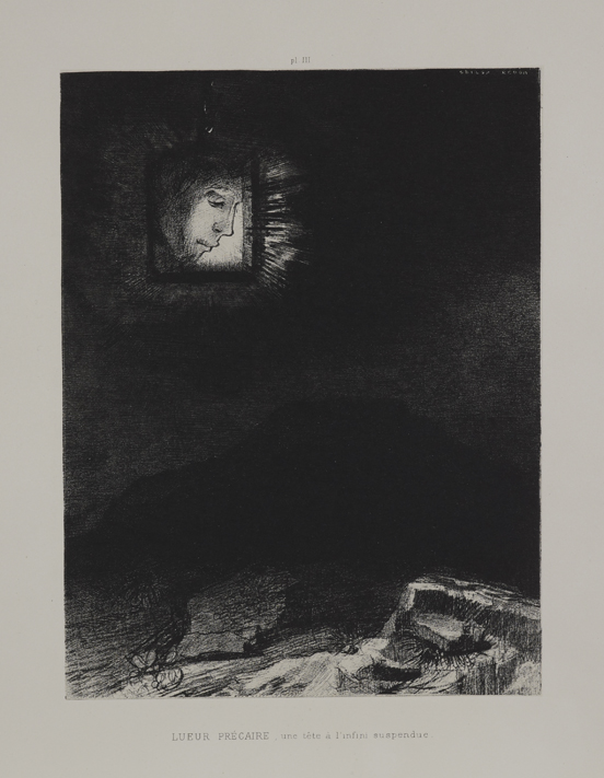
Odilon REDON, Dreams Ōģó. Precarious glow, a head suspended from infinity, 1891
In contrast to all this there's a small gallery dedicated to Redon's dark, monochrome pieces - a nice, if abrupt change from the previous melange of bright colours.

Henri Matisse, Ōģ® Pierro's Funeral from Jazz, 1947
The star of the exhibition, of course, was the wall of Matisse's stencils - eye-catching and delightfully modern, with all kinds of abstracted shapes in bold colours. It was (almost) a shame that there wasn't any cool jazz in the background to accompany these poster-like pieces. So appropriately jazzy were these stencils that I found myself wishing that we were in a narrow staircase leading to an underground jazz bar, instead of a starkly lit museum.
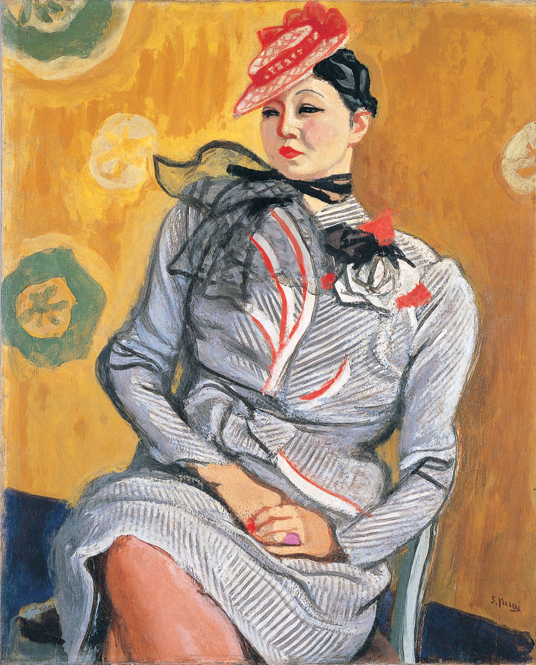
YASUI Sotaro, Portrait of Mrs. F, 1939
Towards the end of the exhibition was a gallery of modern Japanese oil painting, or youga. Particularly interesting were Koga Harue's surreal paintings, Endless Flight and Sentimental Vein. It's not often that we get to see surrealist Japanese painting from the 1930s, and Koga's works were lovely to look at - dream-like and channeling a kind of 80s-style futuristic vibe. (In a good way, of course.)
Somewhat to my bemusement, a room at the very end was dedicated to contemporary Chinese painter Zao Wou-ki and his abstract paintings. This, I suppose, is where using colour as a theme can help tie together otherwise unrelated and disparate themes. While partly exhibited to commemorate his death, the museum also hopes that the viewers will simply enjoy Zhou's paintings and his style of deploying colour as part of the ongoing exhibition.
The Colour of Vision, the Colour of Joy is a pleasant exhibition, even if it is a bit of a mixed bag. Certainly, it's worth dropping by if you're a fan of Matisse and happen to be in the area.
The Color of Vision, the Color of Joy’╝ÜRedon's Dreams, Matisse's JazzŌĆ”
Bridgestone Museum of Art, ŃĆÆ104-0031 1-10-1 Kyobashi, Chuo-ku, Tokyo
Runs until September 18th (Wednesday)
10:00 - 18:00 (Friday ŌĆō 10:00-20:00) Last entry 30 minutes before closing.
Closed Mondays.
800 (600) yen; Seniors over 65 w. ID: 600 (500) yen; Students w. ID: 500 (400) yen; Under 15 w. ID: Free